Microsoft UWP Media Sample
DESIGN DIRECTION, UX & UI DESIGN
The Media sample was the first Universal samples within the Windows 10 ecosystem and designed to work across all devices. It was conceived based on 3rd party partners need and the request for a templated system to get them started with.

At the time, Xbox One was a large driver and attractor for many companies to bring their apps to Microsoft. Windows leadership saw the opportunity and wanted to increase its adoption for consumer/entertainment related apps with the Windows store as well as increase overall sales and benefits to buying into Windows 10 and Windows products.

Defining a sample for all
The first step was to define the role of what the sample should be and what defined it. I set out to create a definition for the project that was clear and was easily agreed upon by all parties. It was:
The core role of this sample is, to create a base level media app experience through a series of templates across a variety of devices, that will help developers and partners get a head start when designing an app experience in Universal Windows Platform.
With the pre-existing simple media template for Xbox One only and also the immense requests for media related support in the Windows ecosystem. It was a natural choice to specifically designed a sample around media first.
With sample type selected, it was now important to do extensive research on the different types of media apps that existed and the core makeup of them for all devices.
Because the sample wasn’t catered only to media specific apps, it was also super important to think outside of the box and consider the other types of products that might want to leverage this template for their application.
In order to optimize for all of the different scenarios, I listed out all the different type of possible app types, key scenarios for the templates, basic requirements for any app and determined which type of pages and content would best suit all the different needs. Once I was done with that, I also needed to consider cross device scenarios and use, visibility, accessibility and extensibility. After those key pieces were complete. It was time for flows and finally wireframes to complete the structure for what the sample was to be.
.
The end result of the sample consisted of:
5 primary patterns used for adaptability(hub, Nav pane, active canvas, master detail and tabs)
4 primary pages and 12 controls
At the time, this was considered the most robust sample for the Universal Windows Platform

UX FLOW


Ensuring your content can work
With 5 different device sizes and the considerations around each device. It was super important to think through how the content would respond, as well as what types of content type and size would work best. Not only did the sample provide guidance around how to structure templates but how Microsoft suggested to align padding, spacing, and size type for most apps.
Also, with Xbox One, there were additional considerations like title safe area, and web vs native app ingestion (at the time) that needed guidance embedded into the page templates. Below are the content sizing outlines that were created for each device.


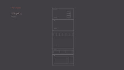
The beauty in a home
"Home is the hero and should always entice a user.
Especially in an app of this type where content truly is king,
Home should be the one to dominate and declare it."
After researching many common styles for apps like this, I came to this style and layout which lent to the most variety to be used as is or the flexibility to be mixed and matched with other components for multiple options.

The four fundamental components used on Home were the SplitView, FlipView, ListView, and Inline Media transport control. Allowing for maximum flexibility in showcasing content types of hierarchy as a primary; secondary; etc., typography use and image representation.

UX


When it's all about the options
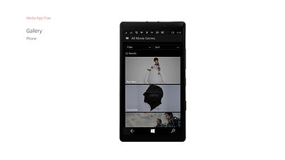
"The Gallery is the workhorse of an app.
The intense browsing or 'let me see all the options' page"
When designing the gallery, I created two layouts for the UX/UI. One which was a more commonly known pattern for mobile to desktop. And a second that was optimally designed for Xbox to adapt to the controller and minimize the amount of joystick movements or ‘button presses’ on the Xbox remote a person might have to take. While the considerations around the number of press states were still important to consider for accessibility on the laptop to desktop scenario it was not as commonly used or known but still thought through and executed in the design.
For the imagery size, I maintained the typical size of 2:1 for the gallery but illustrated examples of other sizes that could be used throughout the sample as a whole.

The two fundamental components used in this page were the Grid view and combo box. Giving the simple yet effective use of the control that illustrated additional filtering, ordering and visual cues.

UX


When movie details matter
"A detail page is an Information Keeper or Oracle of an app.
It’s the final decision maker for a user and needs to answer all those split second calls.
To make it a yes or a no."
When designing the movie details, I looked at numerous examples both internal to the company and externally to ensure that all content and data was accounted for and to also ensure that existing patterns for UX were maintained or brought in to optimize the overall outcome. For movies there were a few additional considerations like responsive buttons based on initial play, resume, restart, the different possible imagery types needed, and what data specific content might have been needed to ensure all important content was front and center.

The five fundamental components used in the movie details were the Ratings, Textbox, Push Button, Vertical ListView, Horizontal ListView. And while the components used were rather light the use of them was super important as they paved the way in showing an ideal mix of minimal UX controls and rich UI blended together.

UX


When a TV show isn't just a show
When designing the TV details, I was able to leverage the basic elements from the movies page to give me a jump start it. However, I then needed to consider the difference that a TV show present like, the need for displaying and filtering between series and episodes, as well as the additional data labeling needed for TV specifics. Because we were launching the sample at the launch of many new apps for Windows 10. I worked with many of the core teams from various apps within Microsoft to ensure that the designs aligned with the patterns and language we wanted to promote for UWP.

The five fundamental components used in the TV details were the Ratings, Textbox, Push Button, Vertical ListView, Horizontal ListView. And while the components used were rather light the use of them was super important as they paved the way in showing an ideal mix of minimal UX controls and rich UI blended together.

UX


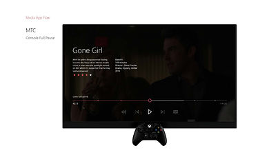
The importance in seeing it play
"The Media Transport Control is the foundation and the 'key' most important part to making a media app.
Without it. It’s not a media app."
The media transport control was not only pivotal to the sample but also a key player for the Windows 10 ecosystem and all apps coming in internally and externally for Windows 10.

The creation of the MTC was an initiative that I had taken on at the same time as this project. For a more in-depth deep dive around the MTC see Microsoft Media Transport Player.

UX


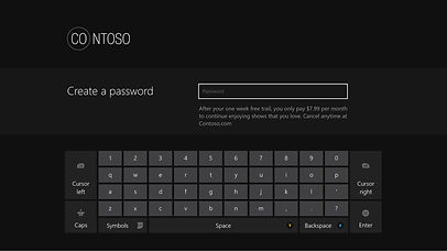
Creating an account to make it your own
With any good application there is always a need for a good account setup and sign-in. Based on my previous work experience creating the Xbox One setup and history with the Microsoft Account system, I had a little insight on how to already think about designing a system on the Microsoft Platform. But I knew that knowing that was not enough because it wasn’t just for an internal app. I also researched numerous external applications to ensure that the work I was doing was solid and represented the vast number on needs that someone might encounter.
To ensure it wouldn’t be too daunting for users, I simplified the system as much as possible and reduced the steps to make it clean, simple and easy to get into and out of.

SIGNIN


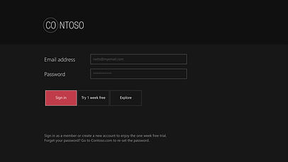
SIGNUP


Searching made simple
One key component of any good media sample is the ability to search. But for this sample I wanted to create a search that was signature for app. It was important to ensure that all the key important considerations were included and thankfully with my history in working on search and store with Xbox, I had a wonderful base to start from. I kept the UI clean but wanted to add prominence to the action at hand “searching”.
By keeping initial lockup of a search field, text control and use of color together and center. It created a great cue for the action at hand and worked great as a focus point when transitioning to the results page.

UX


Seeing is believing in devices
While designing screens in their respective device size was great for layout. It never really gave a perfect picture of what the final outcome would be. Due to the wonderful work of one of our tech designers, a cross-device application and device stand system made it possible. Testing sizing, placement, density, and alignment were no longer an idea but reality with design testing throughout the design process. My team and I regularly tested all designs throughout the process and leveraged it for all broader share out and reviews.


Sharing with the world
I had the privilege to speak at Build 2015 and introduce the world to this first ever cross-device sample. In the presentation I and my co-speaker walked the audience through the premium sample app built on the new Windows 10 Universal App Platform. We demonstrated how the sample app’s UI models and user experience translates on each core device (phone, tablet, desktop, Xbox One, Surface Hub), and will showcase the Universal App Platform’s capabilities.